When a user clicks on your website, they decide whether they want to hit the back button or continue forward within seconds. There are a few things that factor into getting visitors to stay on your website. Making sure your site has these attributes will help ensure that visitors stay on your website. In this post, we will be discussing the first five things visitors want to see when they land on your website.
1. An Attention-Grabbing Homepage
Your homepage is your main chance to convince your visitors to stay on your site and become a customer. There are many factors that go into a great homepage. Since it is the first thing your visitors see, it serves as a short pitch as to what your site is all about. Your homepage should show visitors what they’re looking for, where to start, and show your company’s integrity. Using a small amount of copy can accomplish all of these things as long as it’s effective.
You also want your homepage to include a call to action. Giving your visitors some direction when they enter your site can help boost conversions. Make sure to put your call to action front and center where they can clearly see it. Keep your homepage design simple and to the point. Also, keep the important elements of your homepage above the fold. This way, visitors can see all the information at once when they first enter your site.
2. Fast Website Speed
If a website has even a slightly slow load speed, the chances of a visitor waiting for the site to load are slim. Fast site speed is probably the most important thing you can have on your website. A faster website comes off as reliable and more professional than a slow-loading website. Even if your product is better if your site is slow your customers may move to a competitor with a faster site.
Speed can also affect how your website ranks in SEO. Websites with fast loading times tend to rank higher than sites with slow loading times. Don’t sacrifice your quality content for faster load times though. Work to find a balance between quality content and faster load times.
3. Easily Accessible Contact Info
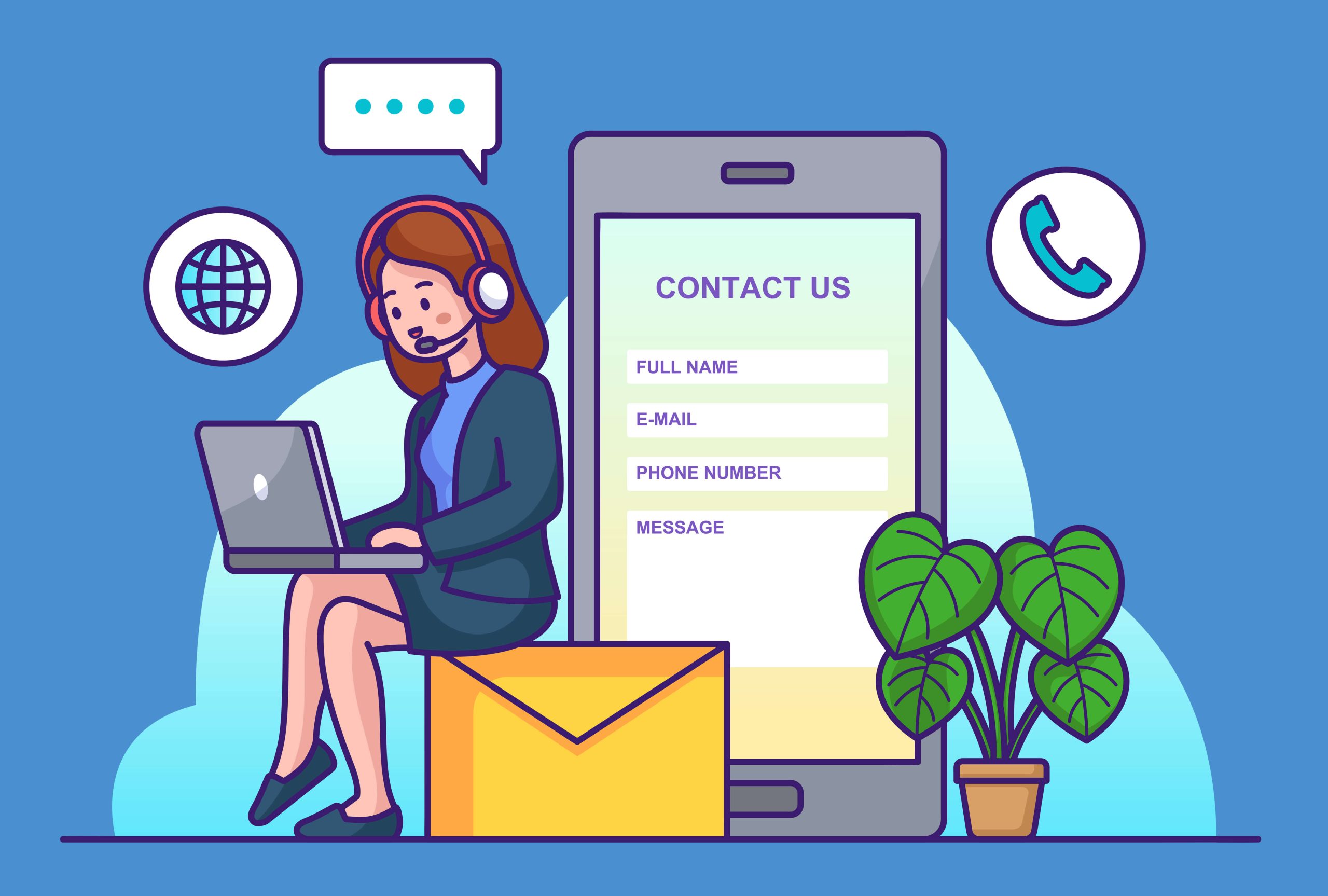
One of the main reasons a visitor is coming to your website is to find out how to contact you. Make sure to include a link to your contact page on your main navigation bar so customers can easily access this information. Having your contact information easily accessible can help lead to more conversions for your website. You can take it a step further by also including all your contact info in the footer of every page of your site.
4. Simple Navigation
When a visitor first arrives on your website, one of the first things they will be looking for is your main navigation area. Make sure to keep your navigation bar simple and easy to use. Keep your navigation points to a minimum and keep the titles short and sweet. Some common points include things like About Us, Services, Contact Us, Shop, etc. Pick navigation points that work best for your business and for your customers. This may take some time and testing different combinations, but it will pay off in the long run.
5. A Clean, Simple Design
Having a website with a clean, simple design will help show your customers you’re running a professional business. Your customers want to see a clean and branded website that helps promote site engagement. If your website is too cluttered or formatted incorrectly, visitors will most likely leave to find a better site. Being able to provide a smooth experience for your visitors will increase the likelihood that those visitors will turn into customers.
Ready to clean up your website? Contact us today to get a quote!




Recent Comments