Welcome to 2016, the year of top-notch web design!
The Webaholics team is very excited for the coming months ahead as we plan to grow substantially with new clients and team members. We are also excited to learn new things about the online world – including new web design tactics.
Since it’s a new year, Awwwards.com released it’s list on the top web design trends that companies should transition to. The cool thing about this list is that we use many of these trends with our clients’ sites today.
Here’s a list of trends we use in many websites we design and build:
1. Hero Images
The main goal of a homepage is to grab your customer’s attention. Having a hero shot as the main banner is one of the best ways to hook users the fastest way possible. Vision is the strongest sense we as humans have, and many web design firms (such as Webaholics) are taking advantage of this sense to bring customers in for clients. Here’s an example of a hero shot from our client, Motion State.
2. Large & Small Scale Animations
Animations are another method of grabbing necessary attention in certain areas of a website. Animations can range from complex movements to simple scrolls and pop-up text. They all focus on the same goal of transferring information and messages to customers and users in an easier and more entertaining way than just reading plain text. Here’s an example of an animation that we did on the homepage for our client, NewStar Solar.
3. Material Design
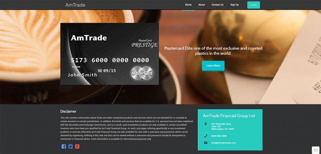
Less is more. That’s the goal of the style that Google has coined “Material Design”. The concept of this design is to use simple shadow techniques, and movement and depth concepts to make pages more realistic to users. It’s also a new method to create clean, modern, and professional websites to represent a company’s brand. We used Material Design styles for our client, AmTrade.
4. Mobile Responsiveness
Who doesn’t have a phone or tablet these days? More people are using mobile devices to looking at websites than ever. At Webaholics, we take pride that each website we design are mobile responsive.
Each site we build will fit perfectly on any computer, smart phone, and tablet. This gives our clients the upper hand on their competitors when customers are in a hurry to do research. An example can be seen here with our client, Brews on 7th.
5. Long Scroll
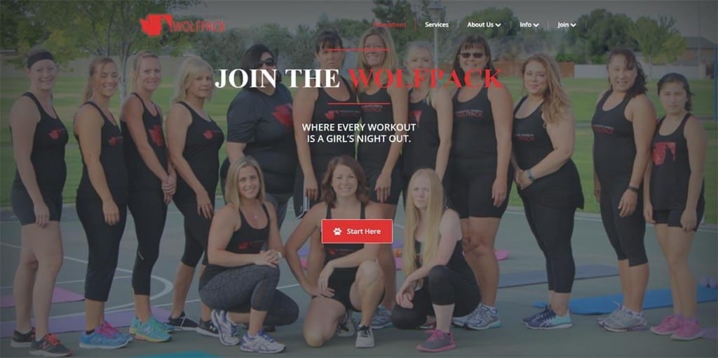
With mobile responsiveness also comes long scrolling. Now, companies are wanting to use this technique to place as much information as possible on the homepage, while also being clean and organized. Long scrolling pages can also lure users with story telling. Many of our clients, like Washington Women’s Wolfpack, use long scroll in order to attract potential customers, and to tell them their story.
There are many more new techniques and trends the Webaholics team will learn throughout the year. If you would like to know more about what web design trends would work best for your business, give us a call at (801) 432-0676, or shoot us an email at info@webaholics.co.


Recent Comments